
When someone says, “I’m a visual learner,” the use of graphics, diagrams, or charts often lead to a clearer and well-rounded understanding of the concept at hand. This is one of the many reasons why a principal pride-point at OH Predictive Insights is our practice of delivering digestible data in visual formats. While we could simply list out election results and fire-off percentage points, we believe our data is most meaningful when visually conceptualized.

No matter the election, mapping results from a geographic viewpoint helps illustrate the insights within the data and can provide clarity on vital questions like:
- Where are the concentrations of each political affiliation in the area or region?
- In which districts and specific areas did each candidate in question perform best?
- In which areas did they perform poorly?
- Which areas in the region house meaningful concentrations of "swing" voters?
What is Mapping?
This service maps the result of an election within a specific geographic area in the state. It is a powerful tool which takes targeting voters to a whole new level. By breaking down election results or voter density into its individual precincts, organizations and individuals will be able to identify exactly where within an area support comes from – in some cases analyzing a district block-by-block. This will not only allow you to see where in the district a given candidate performs or has performed strongly, but also allows you to identify where in the district “swing” voters live.
Real World Examples
Maps like these are used frequently in various news sources like The New York Times and The Washington Post, and are used by industry-leading election forecasters like the Sabato’s Crystal Ball at University of Virginia’s Center for Politics. These maps allow both the data analyst and the article readers to explore in detail the voter blocs of a given election in a targeted area.
What Races Can You Map?
While the specifics of each race type may require varying degrees of analysis and hours, maps can be generated for virtually all races. Listed in ascending order of hours and analysis required, here are some of the different types of races that OHPI can map results for:
- US/State Senate
- US/State House
- Governor
- President
- Statewide Ballot Propositions
- Sheriff
- Overall Turnout
- Local Ballot Propositions
- School Board Members
- And More
Types of Maps
When it comes to data, visualization possibilities and lenses to look through are seemingly endless. To help inform your mapping decisions and organize your efforts around the map type that suits your objectives best, here are some brief descriptions of types of maps that OHPI can create:
|
Legislative District |
Analyze a Legislative District |
|
One Race |
Analyze one Race within the chosen Legislative District |
|
Second Race |
Analyze a second Race within the chosen Legislative District |
|
Race 1 Winner’s Margin Map |
Map with precincts within a Legislative District shaded by the size of the winner’s margin in Race 1 (see example below) |
|
Race 1 Split Map |
Map with precincts “split” by winner’s party (i.e., all precincts won by the Democratic party are blue, all won by the GOP are red, see example below) |
|
Race 2 Winner’s Margin Map |
Map with precincts within a Legislative District shaded by the size of the winner’s margin in Race 2 (see example below) |
|
Shift and Split Maps |
The split map shows the precinct winner “split” between both races (i.e., precincts which voted for 2 Democrats in blue, 2 Republicans in red, and 1 Democrat & 1 GOP in purple, see example below) The shift map shows the shift in vote margins from Race 1 to Race 2 (i.e., darker red precincts indicate a higher GOP margin in Race 2 than in Race 1, darker blue for higher Democrat margin in Race 2, see example below) |
OHPI Mapping Examples
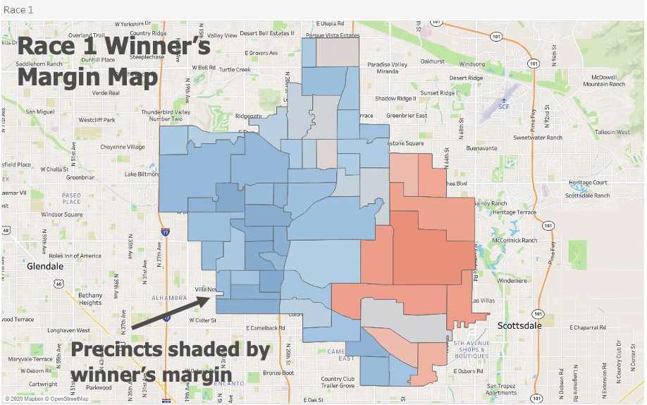
One map with precincts shaded by the size of the winner’s margin – the darker the shade, the better the party’s performance in that precinct
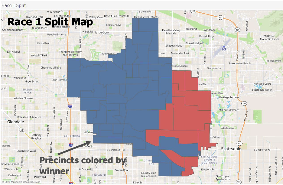
One map with precincts “split” by winner’s party
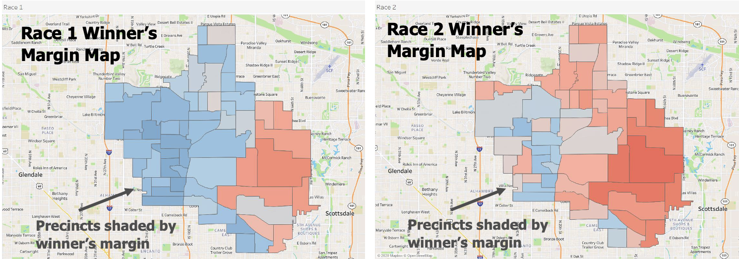
Two maps (one for each race) each with precincts shaded by the winner’s margin
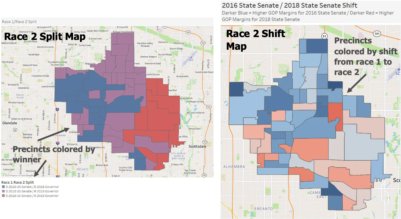
The Spilt Map shows precinct winner split between both races (dark blue indicates a Democrat won that precinct in both races, dark red indicates a Republican won in both races, and purple indicates that the precinct split Democratic in one race and Republican in another).
The Shift Map shows the shift in vote margins from race 1 to race 2 (darker blue = higher GOP margins for race 1, darker red = higher GOP margins for race 2).
Mapping Solutions from OHPI
Precinct Mapping is often used by Political Consultants, Issue Groups looking to target voters, State Parties, and other organizations and individuals looking for more detailed and targeted information on election results and voter trends from a geographic viewpoint. By visualizing the specific sets of data discussed above on a map, you can confidently organize your efforts and strategies with data-driven insights.
Interested in OHPI's Precinct Mapping?
Click here to schedule a meeting with us to discuss the mapping solution to best tackle your objectives
Follow us on Twitter, sign up for our Newsletters, and add us on LinkedIn to stay connected